See How Erika Jane Design Made the Weirdest Kitchen Layout Work

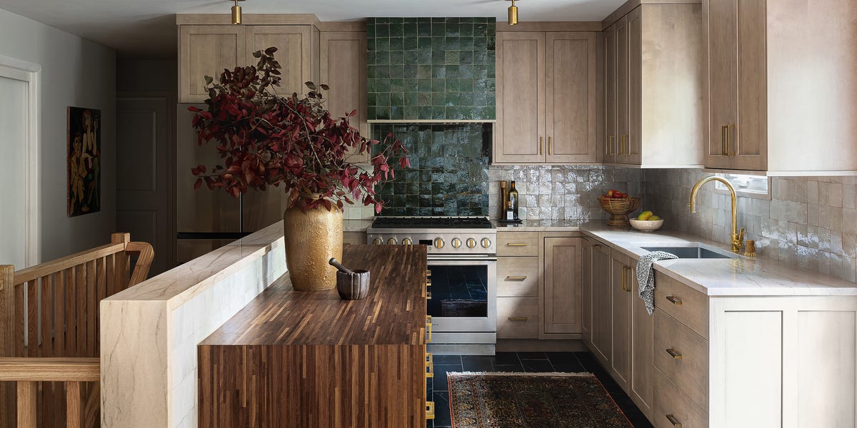
Most kitchen layouts make sense: galley, U-shaped, triangular. The kitchen of this 1956 home in Silver Spring, Maryland, however, has a descending staircase right in the middle of it, thwarting most typical floor plans. “The homeowners still desired as much of an open floor plan as we could give them without a gut renovation,” designer Erika Jayne Chaudhuri explains. So how did her firm, Erika Jayne Design Build, pull it off? They focused on integration.
Boarding up and blocking off the staircase wasn’t an option—the basement still needed to be easily accessible—so Chaudhuri edited it to match the kitchen’s new aesthetic. Her team replaced two of the three half walls surrounding the stairs with an open wood railing. That opened up the kitchen into what had been a hallway, expanding the usable square footage. They had the new railing stained the same color as the original hardwood floors to seamlessly blend the old and new. The remaining knee wall was left intact (it was structurally necessary, so they had to), but they added a run of cabinets along it and covered the area above them in glazed zellige tile to make it useful and beautiful.
Thankfully, they didn’t need to make many structural changes or layout tweaks after they had the stairs sorted, so they got to spend the majority of the budget on fun finishes, like extending that handmade zellige tile onto the backsplash. “These elements were splurges, but they offered a significant visual return on investment by becoming the kitchen’s focal points and setting the tone for the entire design,” Chaudhuri says. “The homeowners and I agreed the handcrafted tiles were well worth it for their added visual impact and unique character.”
Prior to the renovation, the kitchen lacked storage, and what little countertop area it had was reserved for food prep and small appliances. One of the clients’ major wish-list item was a hidden microwave: They hated the way their previous appliance looked out in the open. Chaudhuri delivered: “I love how the microwave is cleverly tucked away,” she says. “We were able to keep the sleek look of the kitchen intact while maximizing every inch of space. In smaller kitchens, every inch of counter space is like gold, and we can’t afford to have the microwave taking up that valuable real estate.”
Cabinetry: WW Wood Products. Quartzite counters: Architecture Stones. Wood countertop: IKEA. Range: JennAir. Refrigerator: Café. Zellige tile: Zia Tile. Slate tile: The Tile Shop. Ceiling lights: Long Made Co. Faucet: Ferguson. Cabinet hardware: Etsy.
Along the newly tile-covered knee wall, lower cabinets provide additional storage. To save money, Chaudhuri topped it with an IKEA walnut veneer countertop—a cost-effective solution that contrasts nicely with the more luxurious quartzite counters she used for the rest of the kitchen. Other budget-friendly ideas include the lighting and hardware. “We snagged those brass fixtures from Etsy—talk about a win-win!” Chaudhuri says. “Supporting small businesses and getting some serious style points.” She picked brass because of how it develops a unique patina, which will ensure the kitchen becomes only more beautiful as the clients live in it.
Follow House Beautiful on Instagram and TikTok.
link


:max_bytes(150000):strip_icc()/GettyImages-1239959628-1992ec9ca1194bd082e13488a44a8916.jpg)

:max_bytes(150000):strip_icc()/GettyImages-2196178842-b558c6c2141b4b8a87412d4860b78fcf.jpg)


